

The insights hub for your environment
Predictive multi-engine monitoring that ties the alarm to its cause, points out what lies ahead, and writes the overnight diagnosis in plain language, not raw logs.
 FuruFlow
An alert without context is just noise
Telling you it got slow is not enough. FuruFlow delivers the alarm already correlated with the cause: which database, which wait event, and which SQL is behind the contention. It doesn’t stop at the symptom, it goes all the way to the SQL that started the problem.
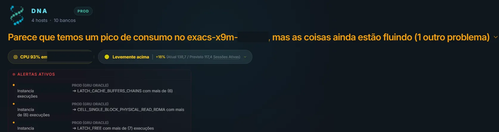
It doesn’t hand you the number, it hands you the read on your environment
The environment warns you. We listen.
Almost nothing breaks without warning. An execution plan changes, a filesystem grows off pace, a backup quietly gets shorter. The platform flags the change on the day it happens, not on the day it takes the application down.
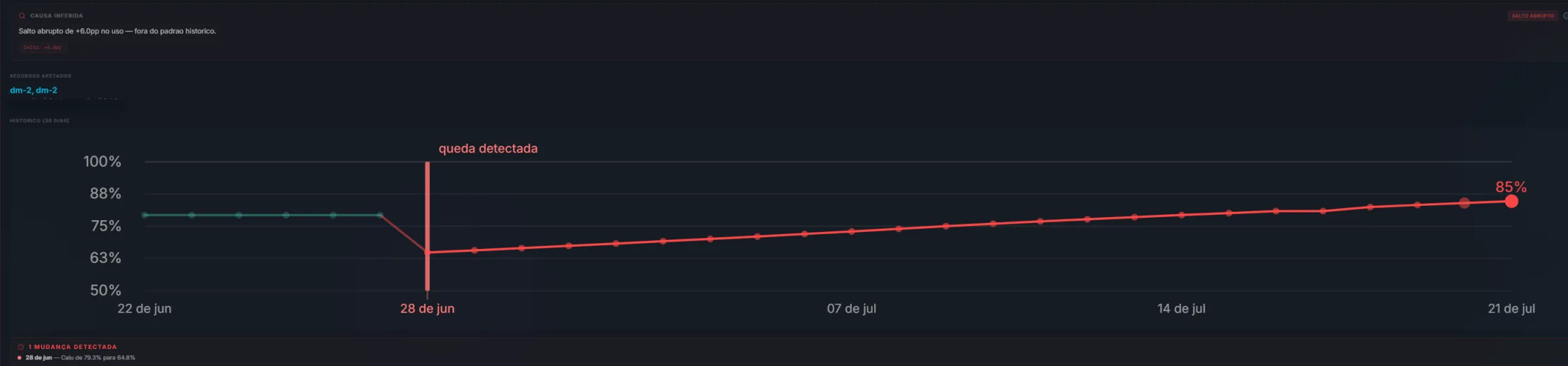
It pinpoints the exact day the behavior changed
FuruFlow learns the pattern of every metric and marks the moment it broke. In the screen below, usage dropped from 79.3% to 64.8% in a single day and has been climbing at a steady rate ever since, with the probable cause already inferred at the top.
And here is what separates this from a crystal ball: every prediction is checked against what actually happened. A pattern that gets it right gains confidence, a pattern that misses loses score and retires itself. The dashboard shows the real accuracy, the “confirmed X out of Y times” tally, so you know exactly how much to trust each warning. Self-learning, for real.
How many days are left before you run out of space
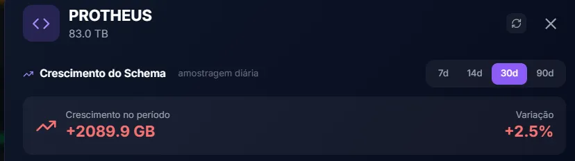
Every tablespace, disk, and diskgroup with today’s usage, the growth rate per month, and the date it fills up. Nobody has to remember to check: the red flag shows up on its own when the deadline gets close.
It is the difference between extending the datafile on a Tuesday morning and extending it at 3 a.m. on a Sunday with the application down.
- Projection per resource, with the date and days remaining
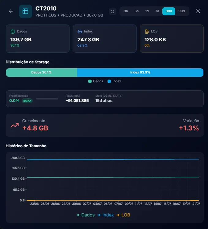
- Schema and table growth tracked day by day
- Feeds the monthly executive report, along with the action plan

And you can drill all the way down: schema by schema and table by table, with the split between data and index, fragmentation, estimated row count, and the size history for the period.
The spike is isolated, measured, and explained
When activity goes off pattern, FuruFlow isolates the exact window, measures how many times it exceeded normal, and opens the wait events that sustained the spike, with the responsible SQL at the end of the line. Next to it, the blocking tree shows the whole chain: who locked, who was left waiting, and for how long.
It is the difference between restarting in the dark and resolving the right session.
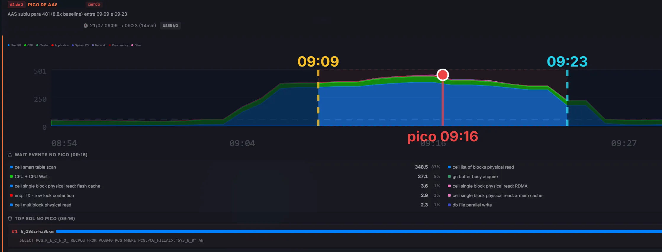
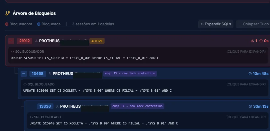
- The spike window isolated and measured against normal behavior
- Automatic correlation from the alarm down to the SQL that caused it
- Less time firefighting, more time on root cause
To predict, you first have to see everything
Insight is not born from a pretty chart, it is born from history. Collection puts server and database on the same timeline: Oracle (RAC, CDB/PDB, ExaCS, Data Guard), SQL Server, PostgreSQL, MySQL/MariaDB, MongoDB, and the AWS managed services (RDS, Aurora, DocumentDB, and DynamoDB), in your datacenter or in the cloud, with PROD and NON-PROD always kept separate.
From processor to process, without switching tabs
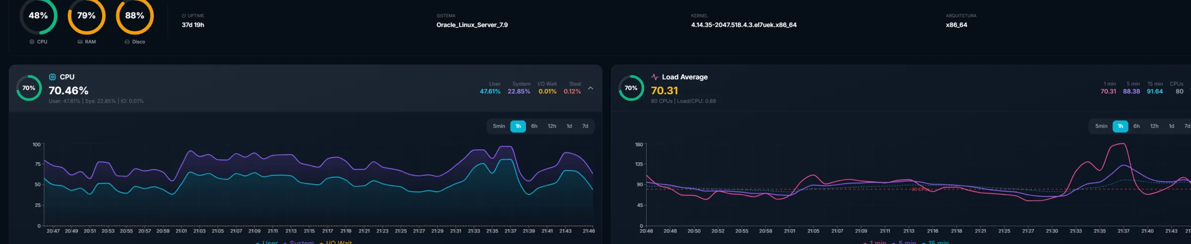
CPU, memory, disk, load, network, uptime, and kernel for every server, refreshed while you watch. It is the layer that almost always explains the slowness that showed up in the database, and here it sits right next to the database, not in another tool.
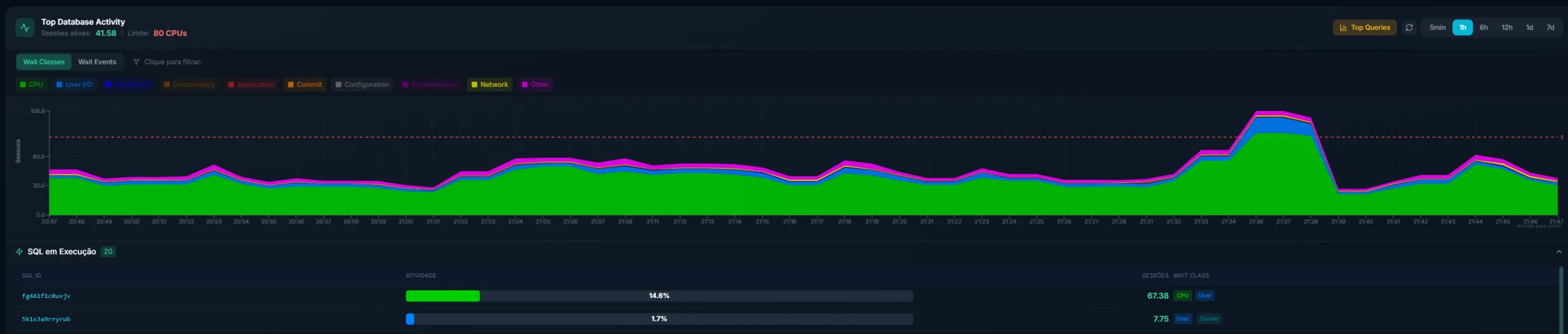
Active sessions against the CPU limit, minute by minute
The database’s real load by wait class, with the CPU limit line always in sight. When the green area touches the red line, the queue has already started, and the team already knows.
- Breakdown by wait class: CPU, User I/O, Cluster, Commit, Concurrency
- Running SQL ranked by share of the activity
- From the 5-minute window to 7 days, on the same chart
The state of the whole environment, in one glance
When the day starts, the first question is always the same: is everything up? The answer comes in hard numbers, and what sits behind each of them is one click away.
Every backup in the environment, on a single screen
How much was generated per day, split into full, incremental, and archivelog. How long each window took. How many ran and how many failed. All in one place, without opening each engine’s console and without relying on the results email nobody reads.
- Daily volume broken down by type
- Duration of every window, day after day
- Any day can be opened to see the detail
- Period close with total volume and success rate
How much was generated. Each bar is a day, split between full, incremental, and archivelog. You can see at a glance when the full ran, when the day was lighter, and when something drifted off rhythm.

How long it took. The duration of each window on the same timeline, full and archivelog kept separate, so the conversation about the backup window stops being guesswork.

And the day from the inside. Click any bar and the day opens up: how many backups ran, the volume of each type, and the duration of each one.

The state right now. Each type with the last run time, size, duration, and result, checked against the agreed policy: RMAN, pgBackRest, SQL Agent, or Event Scheduler, each in its own language.



And the period close, which answers the question that matters: how much was written in total and how many backups finished without a failure.


Hosts, SLA, resolution time, and what keeps coming back
Hosts up, alerts active right now, how many were resolved in the period, SLA, average resolution time, and how many alarms are repeat offenders. One look before coffee and you already know whether the day starts calm.
The calendar paints the temperature of each of the last 30 days, and the list beside it delivers the alarms that repeat the most, exactly the ones that deserve a definitive fix instead of daily treatment.

Every day, your environment wakes up analyzed
An AI agent reads the entire night of metrics and closes an edition on the previous day. The manager gets it in two minutes, the specialist already knows where to look first. And the part that matters for trust: the AI does not make up numbers. Every figure in the text comes from a real query against the environment, and when there is no evidence for a conclusion, it writes “requires investigation” instead of guessing. It is expert DBA analysis, checked against the data, every day.
The AI Daily Brief on your environment, written in the dead of night
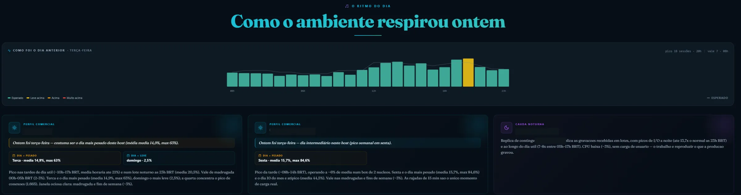
The front page sets the tone right away: calm day or busy day. Then comes the rhythm of the day, hour by hour, with the peak highlighted and the expected line behind it, so you can tell at once whether the day broke pattern or just repeated the routine.
And the brief does not stop at the chart: every host gets its own paragraph, with the heaviest day, the lightest one, the idle window, and what that means in practice. Even the standby replica, which only works in the small hours, gets its own reading.
A whole section for what must never become a headline
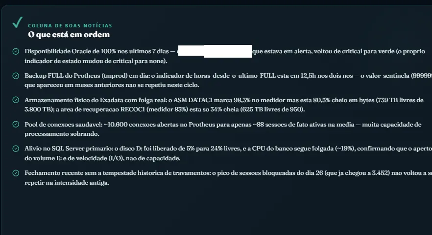
Every risk becomes a story written in plain prose: what happened, how often, in which window, what has already been ruled out as a cause, and what still needs confirming. No stray error codes, no table nobody reads. And there is a section for what went right too: the good-news column gathers what stayed healthy over the period.


- Written by AI in plain language, reviewed by people who live and breathe databases
- Good news and bad news separated in the same story, no sugarcoating
- Arrives before your first coffee, every day, weekends included
What goes up to the boardroom
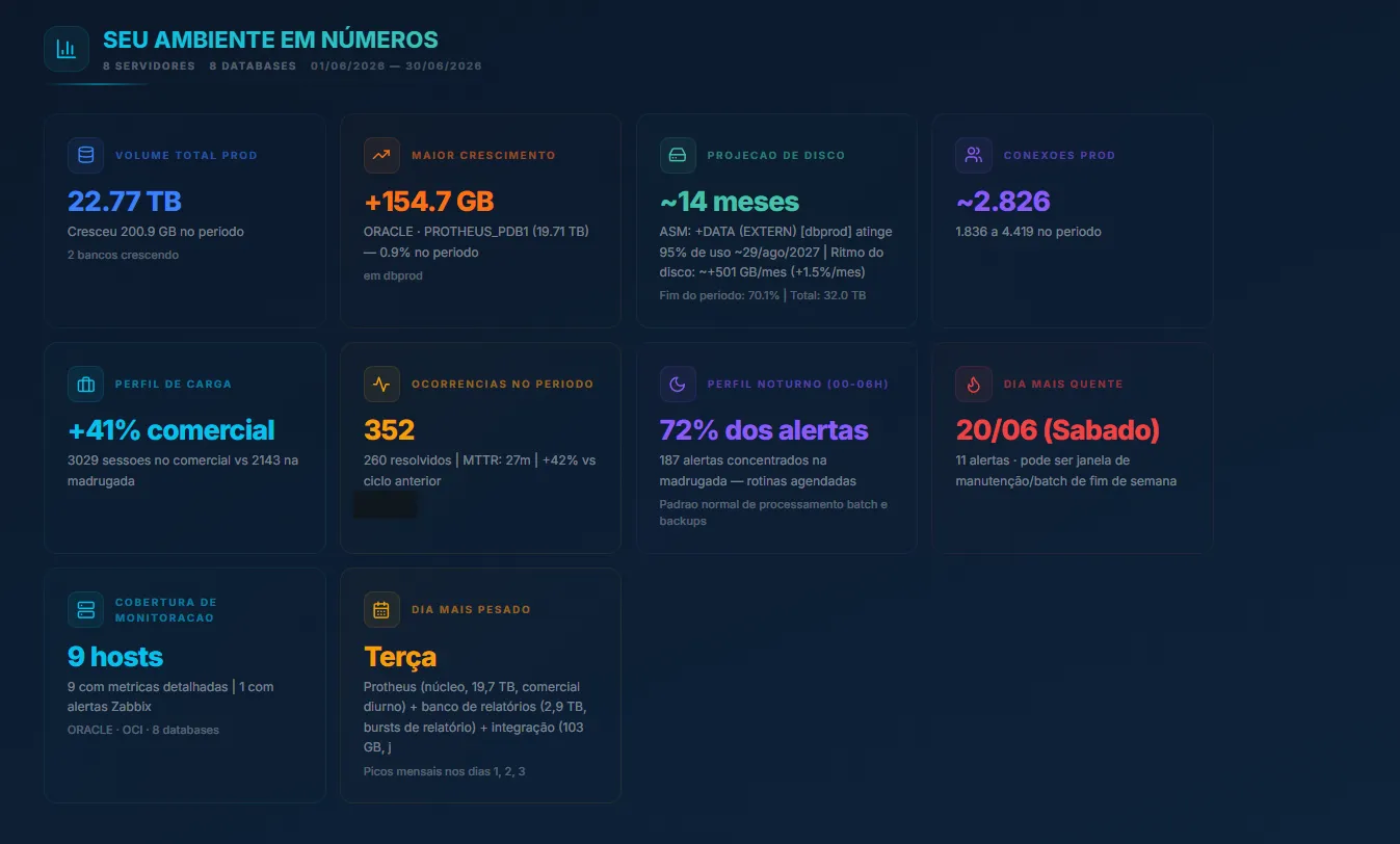
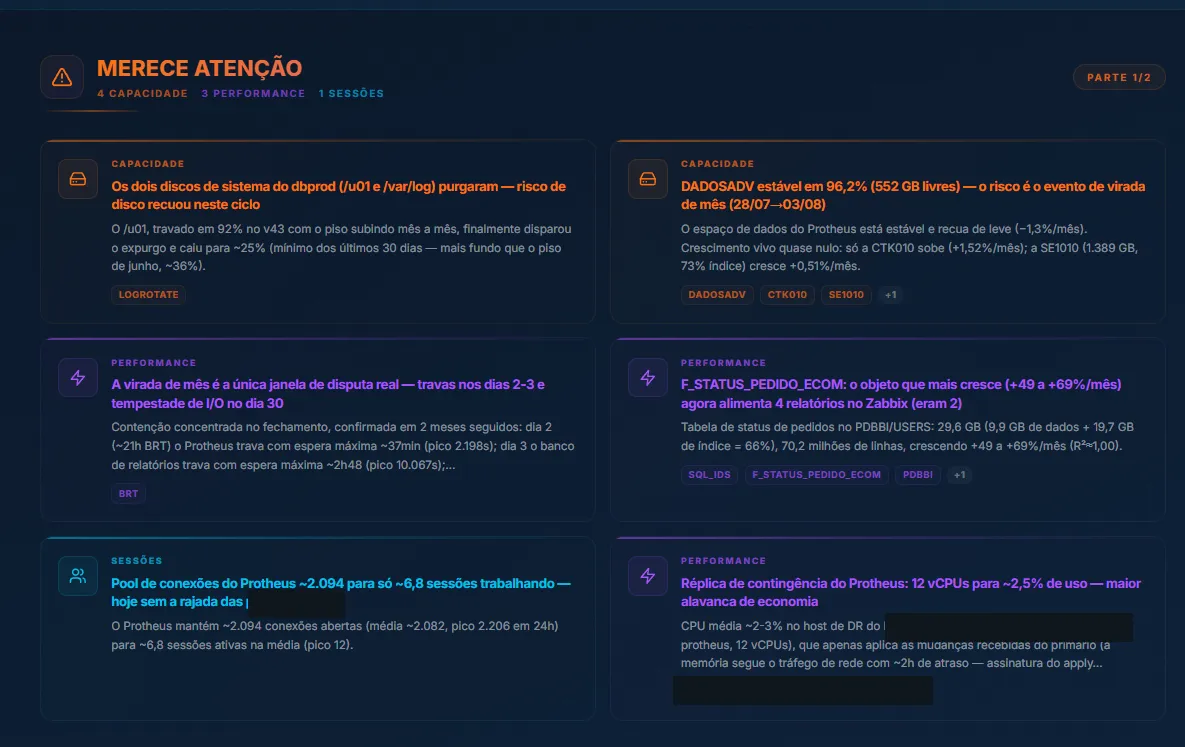
Not everyone wants to open a dashboard. That is why FuruFlow also delivers results in the format the results meeting calls for: a monthly executive report in PDF, compiling a full month of data into pages any manager can read.
A full month of data in three parts
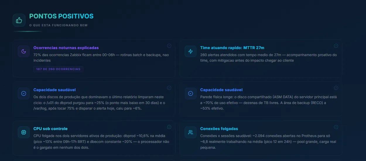
A good report is not just a list of problems. FuruFlow’s comes in three parts: your environment in numbers, what is working well, and what deserves attention, each finding with the size of the risk and the suggested action. The board sees value, the team sees priority.
Cloud cost under automatic watch
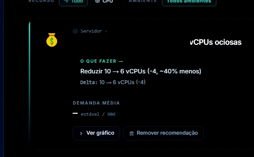
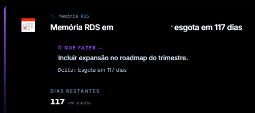
FuruFlow sweeps your AWS environment for money sitting idle: oversized instances, slack memory, idle vCPUs, storage provisioned beyond actual use. Each opportunity becomes a prioritized line, a TOP 5 of what to save first, with how much is at stake.
- Savings opportunities ranked by impact
- vCPU, memory, and storage checked against real usage
- Feeds the monthly report, right beside the capacity planning

On the dashboard, each finding becomes a card with the recommendation already sized: how many vCPUs to give back, which machine class to step down to, how many days until memory gets tight.

What people ask about FuruFlow
Do I need to replace the monitoring I already have?
No. FuruFlow collects through lightweight agents (Telegraf and sql_exporter) on the host itself and runs alongside whatever you already have. It adds a layer of intelligence on top of the database, it does not replace your monitoring stack.
Which databases and clouds do you monitor?
Oracle (from 11g to 23ai, with RAC, CDB/PDB, ExaCS, and Data Guard), SQL Server, PostgreSQL, MySQL/MariaDB, and MongoDB, in your datacenter or in the cloud. For AWS, it reads the managed services straight from CloudWatch: RDS, Aurora, DocumentDB, and DynamoDB.
Is the collection invasive? Do you see my data?
Collection is read-only and runs on your host: FuruFlow reads operational metrics (sessions, waits, size, backup), not the contents of your tables. Each client stays isolated and, as you can see on this page, sensitive identifiers never need to leave the environment.
Does this AI make up diagnoses?
No. It is rule number one of the product: every number in the text comes from a real query against your environment. When there is no evidence, the agent writes “requires investigation” instead of guessing. It is the opposite of a generic chatbot.
How does the prediction work? Is it guesswork?
The system learns what is normal for each hour and day, projects the trend with robust statistics, and validates every prediction against what actually happened. What gets it right gains confidence, what stops happening retires itself. The dashboard shows the real accuracy: you trust based on track record, not on promises.
Does FuruFlow replace the DBA?
No. It arms the DBA. It delivers the briefing ready, the probable cause, and the deadline, so the team spends its time on decisions, not on digging. The one who solves it is still a person.
How long does it take to go live for a new client?
Collection runs on lightweight collectors, no heavy agent. It goes live engine by engine, with PROD and NON-PROD separated from day one. Talk to us and the managed support team will run the onboarding.
See FuruFlow with your own data
A demo with your environment is worth more than any screenshot. In a single conversation we connect a slice of it, show you the diagnosis of your own overnight window, and you decide.